The Bauhaus Colour Thinkers:From Mysticism to Relativity
The Bauhaus school (1919-1933) was an incubator for artistic and intellectual development, fundamentally transforming how we think about design, materials and the relationship between form and function. At its core was an idea that was radical at the time: that good design could improve society, and that artists and craftspeople should work together to create objects that were both beautiful and useful. The study of colour at the Bauhaus exemplified the school's ideological diversity. Johannes Itten approached colour through systematic psychological and spiritual connections, developing his colour star to demonstrate fundamental categories of contrast. Wassily Kandinsky believed in fixed, synaesthetic relationships between colours, forms and even musical tones, treating colour as having universal artistic principles. Albers's philosophy stood in contrast to his peers. While they sought to codify or spiritualise colour, Albers insisted on its "absolute relativity." He famously posited that "if one says red ... it can be expected that there will be 50 reds in their minds," because colour is not a static, physical fact but a highly subjective, personal and variable experience. This attitude towards colour, to try to understand its contextual behaviour without trying to catch it in a rigid framework, has proven to make the work timeless and adaptable to personal preferences, changing tastes and diverse contexts.
The Interaction of Colour: A Hands-On Manifesto
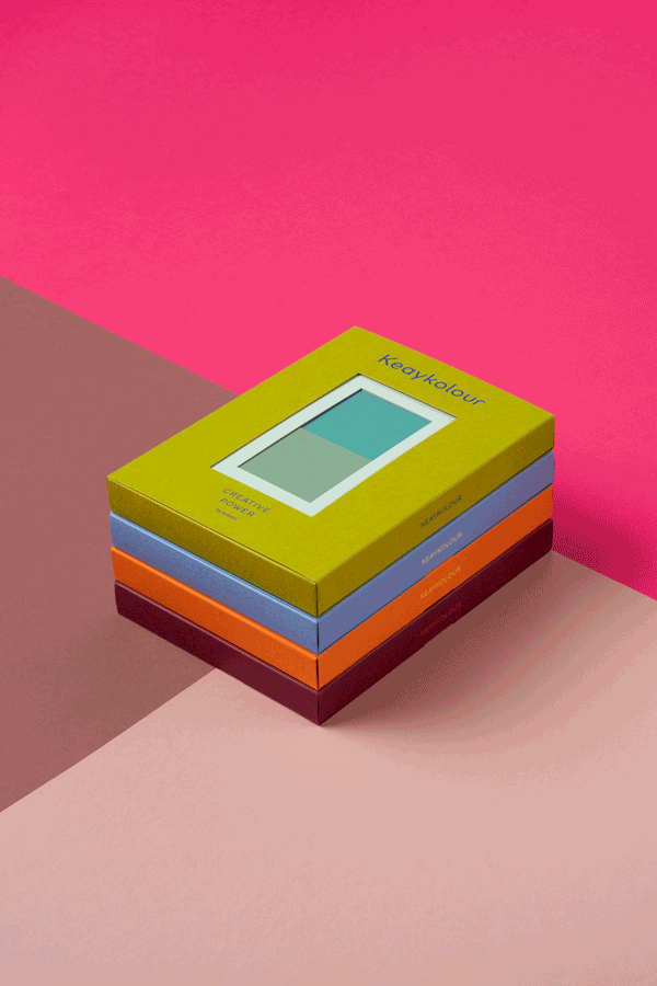
Albers brought together his ideas in his famous book The Interaction of Colour, a hands-on manifesto that paired his theories with abstract and timeless colour compositions, making it relevant and useful for audiences both then and today. He placed the human observer at the centre of his thesis: “in visual perception there is a discrepancy between physical fact and psychic effect.” By this he means that the physical properties of a colour – its wavelength, its pigment – are secondary to how the human mind perceives it in relation to its surroundings. In teaching this principle, Albers rejected traditional colour systems and instead focused on developing ‘an eye for colour’ through a process of trial and error. In his approach he insisted on using coloured paper for his exercises, not paint. This was not born of convenience but out of a conviction that coloured paper has favourable properties, such as colour consistency, ease of use and even pigment distribution. This simple decision makes the theory of Albers a useful starting point for a modern design practice that begins with a pre-selected tactile palette, like the Keaykolour collection, to experiment with colour compositions.
Composing colours as musical notes in a visual symphony
The artist Kandinsky famously experienced synesthesia, due to a medical condition that made that he ‘saw colours when he heard music’ and vice versa. This connection was a key driver in his move toward abstract art, as he sought to create visual compositions that resonated with the emotional and spiritual power of music. He drew inspiration from the formal structures of music, including rhythm, harmony and counterpoint, attempting to translate these principles into his paintings. Kandinsky believed that art, like music, could develop powerful emotional and spiritual qualities, aiming to convey a ‘symphony of colours’ in his compositions. While Josef Albers put much less emphasis on the spiritual aspect of both colour and music, he explicitly linked visual art to musical forms, and he applied principles of musical harmony to his study of colour. He created works that explored the repetition, rhythm and dynamic movement found in musical structures and he composed precise interactions of colours that would create effects akin to musical chords. His drive to develop ‘an eye for colour’ can be seen as the ability of musicians to play melodies and harmonies from intuition, yet based on practice and rehearsal. He applied principles of musical harmony to his study of colour, particularly in his renowned Homage to the Square series, where the precise and harmonious interaction of colours could create effects akin to musical chords.
Relativity of Colour for a designer today
“Colour is the most relative medium in art.” With this statement Albers argued that we don’t see colours as they physically exist, but rather that our perception is constantly being influenced by their surroundings. A colour therefore does not exist as it is, but rather as an interpretation of itself by us. Through self-designed visual exercises, Albers demonstrates how a single color can appear as two different hues depending on the colours that surround them, and even how two completely different colours can be made to look nearly identical depending on their context. This phenomenon, known as simultaneous contrast – first described by Michel-Eugène Chevreul, proves that there are no absolutes in colour; our understanding of a colour’s lightness, darkness or intensity is entirely dependent on its neighbouring colours. The approach to colour of Josef Albers fundamentally shifted colour theory, moving the focus from rigid systems and rules to one of practical, experiential learning. This makes it particularly valuable for contemporary practitioners. In modern day design, the relative behaviour and the interdependencies of colours can greatly influence a design or an interface. It is therefore a crucial skill to explore and examine these behaviours and use them consciously. Understanding that colours carry emotional weight and that their interactions can amplify or diminish these effects allows for more intentional and strategic colour choices. A red that feels aggressive in one context might appear energetic in another, requiring designers to develop what Albers called ‘an eye for colour.’
From Theory to Tactility: Contemporary Applications
The rich history of colour research in art and design offers several practical advantages for contemporary designers and brands. A notable, and direct inspiration lead to a Josef Albers inspired scarf collection by Hermès, printing colour compositions with minute detail onto fine silks. Design studio Atelier Bingo created "Stéréo Couleurs," a book constructed entirely from handmade collages with cut-out papers. While the book of Atelier Bingo is more playful and not theoritical in its approach, the use of paper to create attractive colour combinations channels the same pleasing and tactile way of working. The playful and experimental combining of colours to form intricate and unique narratives also forms a key tool for brands to curate large collections of colours and help designers and customers to feel guided. The Danish paint brand Bleo invites leading creatives to create their own curated palettes, and their Colour Interactions Palette demonstrates how Albers's principles have been distilled into a commercial range of paints that work within his framework. Curated from Albers's original plates, the collection reduces hundreds of potential hues into a precise, intuitive palette. This curation process embodies Albers's belief that constraints foster creativity rather than limiting it, offering consumers a sophisticated yet accessible entry point into colour theory. In the digital age, physical experiences that invite touch create more intimate and memorable brand experiences. Harnessing the power of touch and tactility, brands across the fashion, luxury and retail industries realise that paper is one of the last physical touchpoints where they can make a difference and using coloured paper, brands are utilising the emotional reaction that people have towards colour.
Building a Culture of Colour Learning
Perhaps Albers's most profound legacy is not his paintings or books, but his pedagogical method. He believed that what counts is not “so-called knowledge of so-called facts, but vision — seeing.” He taught a process, not a set of rules, encouraging spontaneity and inventiveness through systematic exploration. For contemporary designers, this translates into a practical approach that can serve as a framework to gain confidence in choosing colour compositions. Rather than focusing on individual hues, starting with seeing colour relationships creates immediate intuitive insight. Developing these colour combinations into colour stories can support brand narratives in new and surprising ways. By embracing experimentation, iteration and unexpected combinations, the fear or making mistakes is removed and the freedom to create allows for interesting and new results. Once this practice becomes a second nature, considering the full context – including different adjacent materials and textures – a creative can build confidence in articulating why certain combinations work. Albert Einstein was quoted stating that “Intellectual growth should commence at birth and cease only at death.” This principle applies very much to the career of a creative, where a life of learning leads to a rich journey that far outweighs any specific result of that journey. With that intention of eternal curiosity, the Compose with Colour Inspiration Tool for Keaykolour provides a perfect vehicle for this lifelong learning, encouraging designers to treat every project as an experiment and their studio as a laboratory for testing colour's infinite potential.
Written for Creative Power by Antalis. First published on antalis.com